Ruby’s meter bridge colours for faster level checks
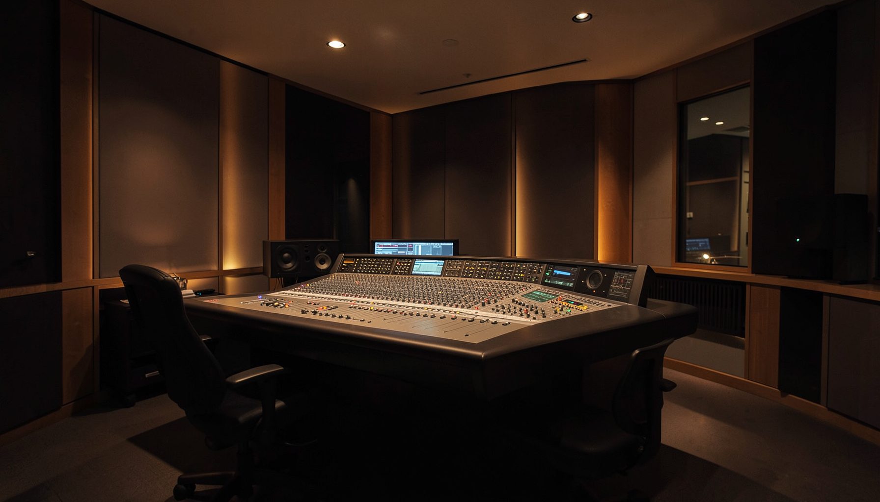
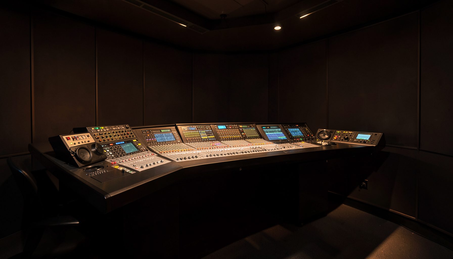
A radio console gives an operator far more information than can be comfortably monitored at once. Ruby’s meter bridge places key level information directly in the operator’s sightline, allowing a quick visual check without diverting attention from the faders, talkback controls or programme output.
Colour customization makes that bridge more useful by turning levels into immediate visual cues. A carefully chosen palette can reveal a healthy signal, a warning or a problem before the operator reads individual numbers. The result is faster recognition and fewer missed level changes during busy live broadcasts.
Why a colour bridge beats reading numbers
Numerical meters remain essential for precise monitoring, but interpreting them takes longer. An operator must locate the relevant scale, identify the value and decide whether it falls within the expected range. Colours shorten that process by providing a recognisable state at a glance.
The strongest cues are simple and consistent. A typical working range uses green for normal operation, amber for an approaching limit and red for overload or clipping. These conventions are familiar enough to reduce hesitation, provided the console’s actual meter values and any associated warnings remain available.
Colour should describe level, not promise overall audio quality. A green channel can still contain background noise, poor microphone placement or an unwanted processing artefact. For commercial radio teams in Sydney and Melbourne, where presenters may move between studio, remote interview and live performance feeds, that distinction prevents a reassuring display from masking a more subtle issue.
Building a scheme that works under pressure
Begin by assigning one clear meaning to each colour. Green should indicate a signal within the chosen working range, amber should signal reduced headroom and red should identify a peak or overload condition. An illustrative mapping can then help engineers distinguish ordinary movement from an event that requires attention.
The colour thresholds must correspond to the metering reference and processing chain used by the station. They should not be selected simply because they look attractive or because they resemble an unrelated display. Calibration still determines the actual reading; colours provide a faster interpretation layer over that measurement.
The palette also needs to remain readable in the control-room environment. Pale amber may disappear under strong daylight glare, while a dim red cue can be harder to notice during an overnight shift. High-contrast combinations, clear brightness differences and labels that retain their meaning help preserve recognition. A documented palette should specify both the colour and its operating meaning, avoiding a verbal “warning colour” that leaves room for interpretation.
These display choices sit alongside Australian regulatory requirements. The Australian Communications and Media Authority regulates broadcasting services and applies relevant technical standards, but an internal colour scheme does not determine compliance. The underlying metering and audio measurements remain responsible for technical assessment.
Aligning Ruby with wider monitoring
Colour becomes more dependable when the console and any associated monitoring displays use the same vocabulary. An engineer should not need to learn that amber means caution on one screen and overload on another. In a post-production environment, Lawo’s networked audio nodes can distribute programme audio to different destinations, making consistent monitoring terminology particularly valuable.
Ruby’s physical bridge can provide the operator’s immediate reference, while software displays support more detailed inspection. Power Core nodes, studio software and virtual radio tools can all fit within that wider workflow, but visual consistency must be maintained deliberately. Colour settings should not be confused with routing controls or changes to the signal itself.
A useful operating standard records the colours, threshold conventions, signal groups and locations of relevant meters. It should also identify which displays are primary references and which are supplementary. This reduces ambiguity when a producer, presenter or visiting engineer moves between the main console and another monitoring position.
Testing colour cues in real conditions
Testing should happen with the programme material, processing and operating levels expected during a real shift. Start with a known source at the normal working level, then raise it gradually until the amber and red states appear. This confirms that the cues are visible, correctly ordered and not easily confused.
VisTool supports custom metering layouts for engineers who need a more useful software view. Those layouts can complement Ruby’s bridge when both follow the same documented colour meanings. A custom software arrangement does not automatically establish the console’s configuration, so the two must be checked against the operating standard rather than assumed to match.
Regional stations and studios outside the largest metropolitan markets add another testing consideration: familiarity matters more when several presenters, technical operators and volunteers share the same facility. Overnight automation and live handovers make that familiarity especially important. The display should remain understandable during fatigue, hurried programming changes and busy community-broadcast schedules.
| Colour cue | What it communicates | What it should trigger |
|---|---|---|
| Green | Signal within the normal working range | Routine monitoring without a gain change |
| Amber | Level approaching the chosen limit | A check of the source, processing and remaining headroom |
| Red | Overload or clipping indication | Immediate investigation of the affected channel and its gain |
A shared visual language for every shift
Effective colour customization creates a shared visual language rather than a decorative display. Engineers and presenters can recognise the same operating state, communicate warnings more quickly and spend less time interpreting meter values. Consistent labels and a written palette preserve that understanding when staffing changes.
Remember Ruby’s meter bridge as a visual contract: every colour must answer one immediate question, and every operator must read that answer in the same way. Fast recognition, clear thresholds and a consistent meaning across the workflow are what turn meter colours into dependable production tools.