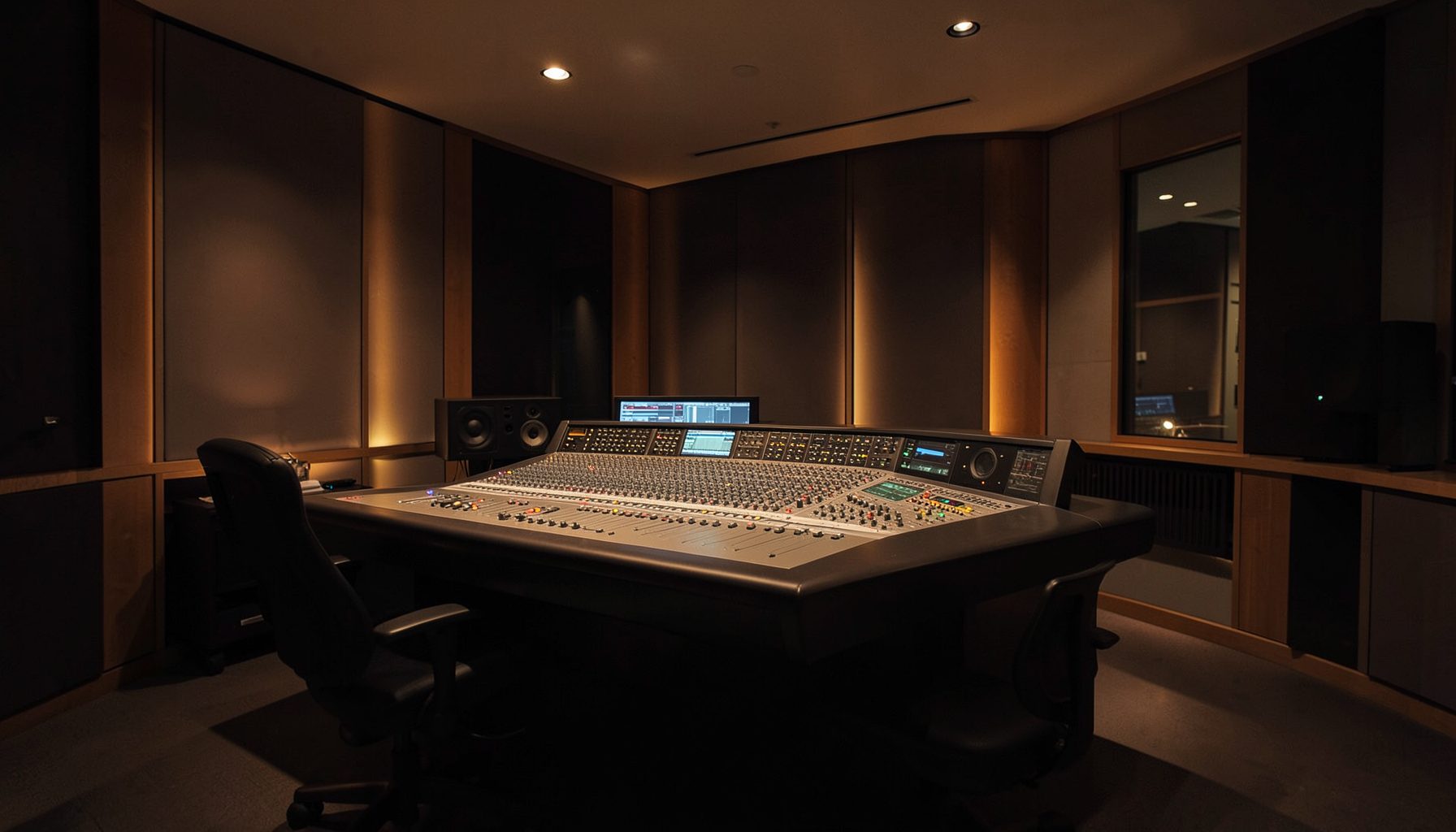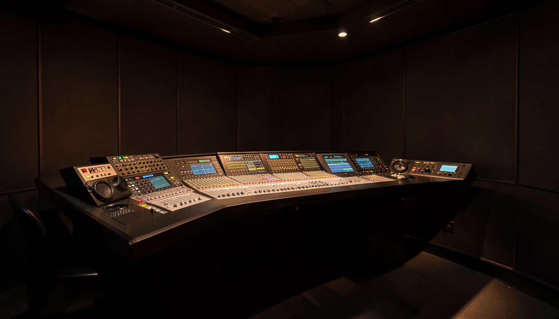
VisTool widgets for custom radio meters and controls
Radio studios need interfaces that reveal the right information at the right moment. A presenter may need a large program meter, a producer may need instant access to routing, and an engineer may want detailed status from the same networked system. A fixed layout rarely serves every role equally well.
VisTool makes it possible to shape a control surface around the workflow. Its widgets can present audio levels, source states, timers, buttons, labels, and operational feedback in a customized visual environment. The result is a practical interface for everyday radio work rather than a generic collection of controls.
Custom design is especially valuable in studios built around networked audio. When consoles, processing engines, and software-defined resources share information, a VisTool page can bring those functions together without forcing users to move between unrelated applications.
Start with the operator’s decisions
The strongest widget layout begins with the actions staff perform repeatedly. A presenter may need to start a microphone, monitor a remote guest, and confirm that the program feed is active. A producer may need source selection, talkback, cue status, and a clear view of automation or playout conditions.
These needs should determine the page structure. Place high-priority information in the primary visual field, use consistent colors for states, and keep infrequent engineering controls on secondary pages. A compact interface often works better than a crowded one because it reduces hesitation during live operation.
It also helps to separate monitoring from control. A meter can show a condition continuously, while a button should communicate whether an action is available, active, or blocked. This distinction makes the interface easier to interpret when attention is divided between the screen and the studio.
Design meters that communicate clearly
A useful meter does more than display movement. It should show the meaningful range of the signal, provide enough resolution for routine monitoring, and make overload or silence immediately visible. Stereo bars, peak indicators, loudness-related information, and color thresholds can each serve different operational purposes.
The scale should match the job. Large program meters are suitable for an on-air overview, while smaller channel meters can help with source comparison. Avoid filling every page with identical bar graphs; a few purposeful indicators usually provide more value than a wall of constantly moving graphics.
Labels matter just as much as meter size. A clear source name, bus designation, or destination label prevents operators from guessing what they are seeing. For changing sources, state indicators and dynamic text can provide context without requiring a separate status window.
Match widgets to radio tasks
VisTool controls can be arranged to support distinct roles across a facility. A producer’s page might emphasize routing and studio communication, while an engineering page could expose device status, signal paths, and diagnostic information. Shared visual conventions allow staff to move between pages without relearning the interface.
| Radio task | Useful widget types | Design priority |
|---|---|---|
| On-air monitoring | Large stereo meters, status lamps, source labels | Immediate recognition |
| Microphone control | Buttons, level controls, channel labels | Fast and unambiguous operation |
| Routing | Source selectors, destination indicators, grouped controls | Clear signal-path feedback |
| Guest contribution | Talkback controls, cue status, return meters | Prevent accidental loss of communication |
| Technical oversight | Alarm indicators, detailed meters, status text | High information density |
Control grouping is particularly important for routing and monitoring. Related actions should sit together, with enough spacing to reduce accidental activation. If a control changes a critical path, pair it with visible feedback such as an active state, destination label, or confirmation indicator.
For automated workflows, a custom page can expose the controls operators actually need while leaving deeper configuration elsewhere. This approach supports consistency across multiple studios and reduces the temptation to give every user unrestricted access to every parameter.
Use color and state with discipline
Color is powerful when it has a defined meaning. Green might represent an available or healthy condition, amber a warning, and red an alarm. The exact palette can vary, but it should remain consistent throughout the studio. A button that is blue on one page and green on another creates unnecessary interpretation work.
Do not rely on color alone. Add text, icons, meter behavior, or state changes so that the interface remains understandable under different lighting conditions and for users with color-vision deficiencies. A muted inactive control and a clearly labeled active control are easier to recognize than subtle color shifts.
State feedback should also reflect real system conditions. A button should not merely change appearance because it was clicked; it should indicate whether the requested action has actually taken effect. This is essential for source selection, microphone status, monitor paths, and other controls that affect live output.
Connect monitoring with wider workflows
A widget-based interface becomes more valuable when it reflects the wider production environment. Networked audio resources, console functions, and processing tools can be presented as part of one operational view, helping staff understand how a signal moves from source to transmission or recording.
This is useful when a studio combines live presentation with automated processing. For example, a page might show the active microphone, program level, processing state, and destination in one place. Where automatic gain handling is part of the workflow, AutoMix processing can complement manual controls by helping maintain consistent speech levels while operators retain clear status information.
The same principle applies to post-production and live performance. A widget layout can be tailored to the context, with fewer on-air controls and more detailed monitoring for editing or technical operation. Reusing visual conventions across these environments makes the overall system easier to support.
Build pages that remain useful under pressure
Testing should take place in realistic operating conditions, not only at a desk during setup. Ask presenters and producers to use the page while speaking, cueing sources, handling a remote connection, or responding to an alarm. Their behavior will reveal whether a control is too small, a label is unclear, or important feedback is hidden.
Keep the first version focused. Start with the essential meters and controls, observe how the team uses them, and then refine the arrangement. Customization should solve operational problems rather than add decoration.
A practical review checklist includes:
- Give every meter and control a clear, readable label.
- Reserve prominent space for program, microphone, and transmission status.
- Use consistent colors and visible active or alarm states.
- Separate routine controls from engineering and configuration functions.
- Test the interface with real users during representative radio scenarios.
Well-designed VisTool widgets turn system data into decisions that can be made quickly and confidently. Define the studio’s priorities, map them to purposeful meters and controls, and develop a layout that supports the way the team actually works. Explore the Lawo workflow and shape a custom operator view that keeps critical radio information visible when it matters most.